An independent studio working across brand identity, packaging, campaign and digital. No account managers. No layers between brief and output — just one person doing the work properly.
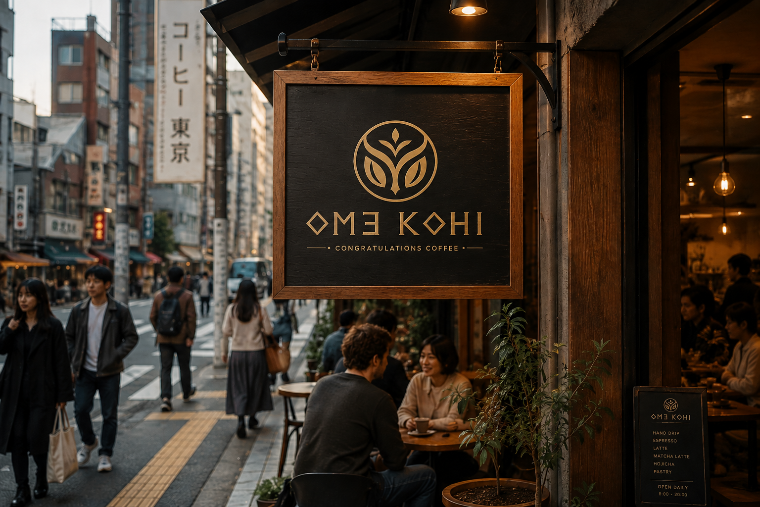
Every cup marks an achievement. OME KOHI is a premium speciality coffee brand built around the concept of Congratulations Coffee — positioning the daily ritual as a moment of personal reward.
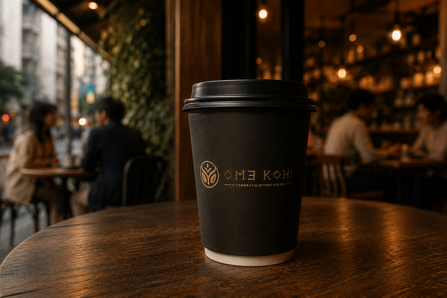
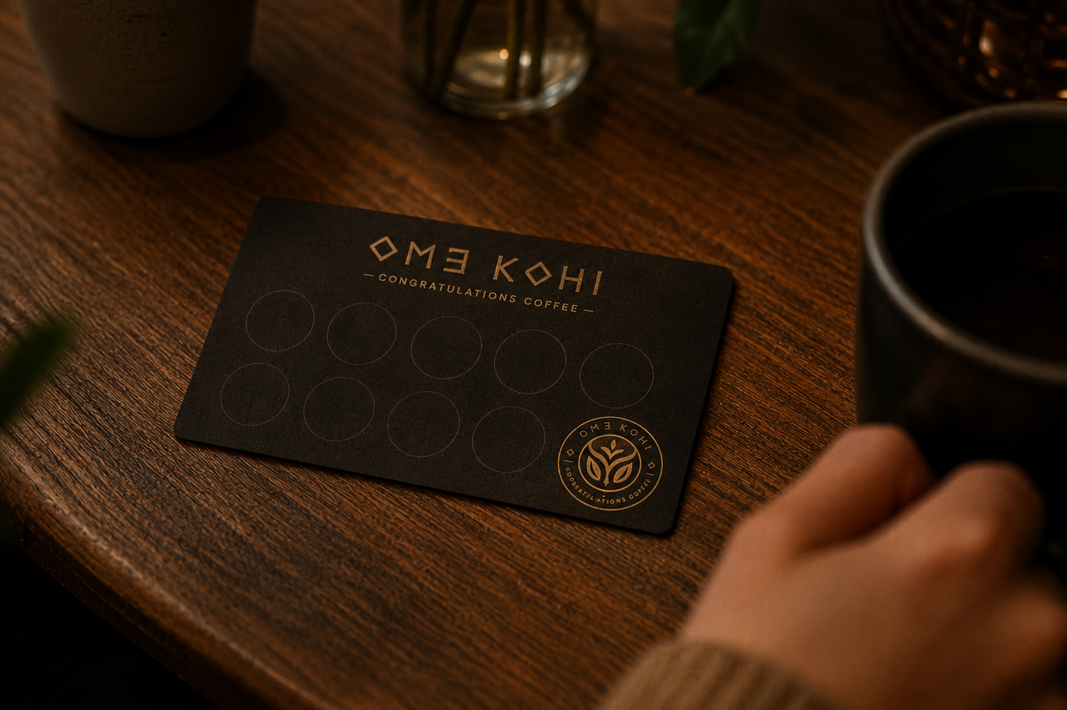
The identity merges Japanese minimalism with Scandinavian restraint: a bespoke emblem drawn from the growth of a coffee plant, refined typography, and a palette of matte black, walnut wood, and metallic gold. Quiet luxury through deliberate detail.
The system extends across signage, packaging, loyalty cards, and takeaway cups. Every touchpoint designed to feel intentional, warm, and materially rich. Conceived as a flagship café for Tokyo.
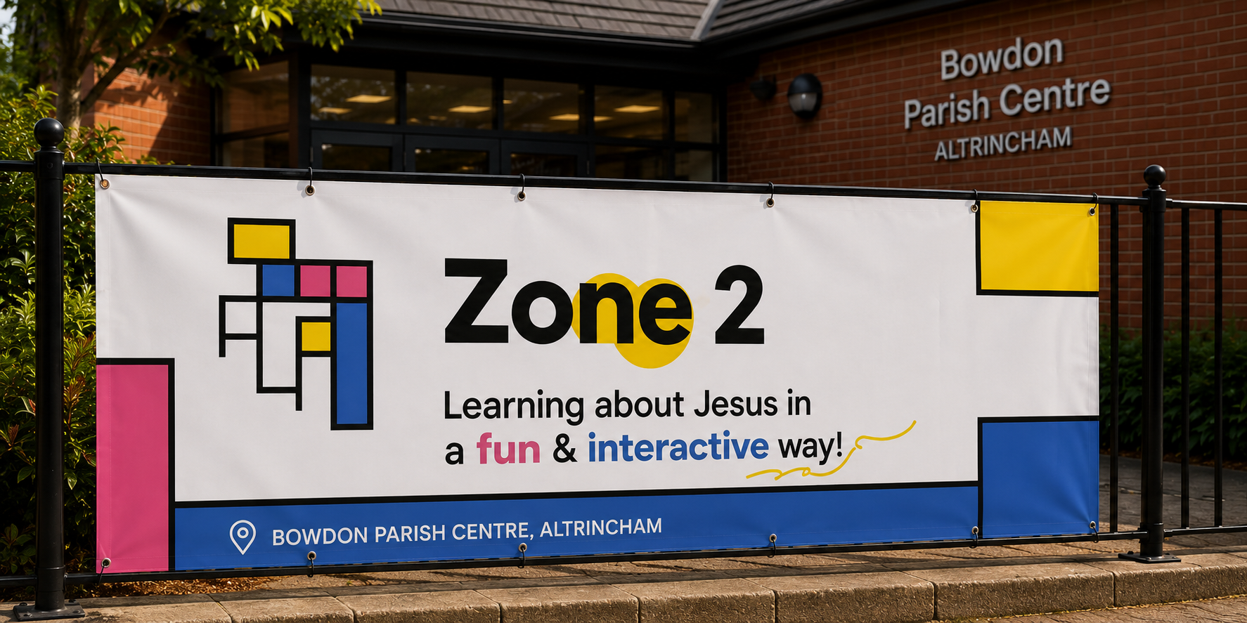
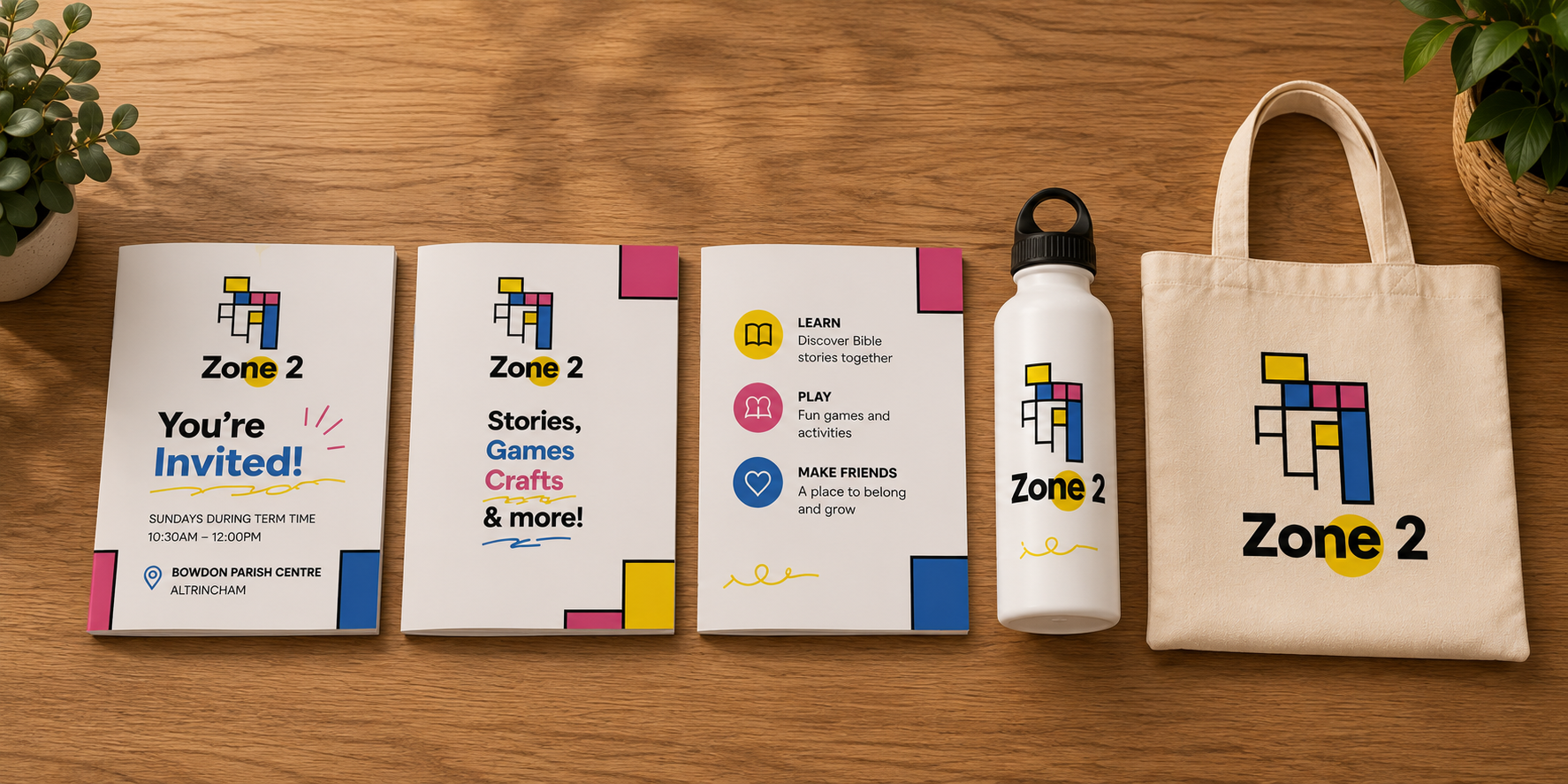
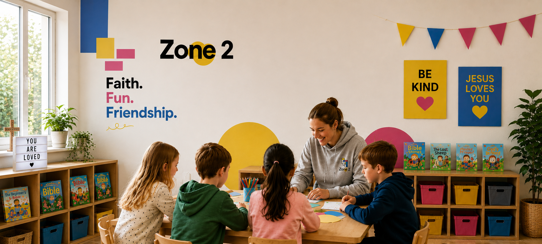
A children's church initiative at Bowdon Parish Centre — teaching kids about Christ through experiences that actually hold their attention.
The brief: youthful, welcoming, contemporary. But grounded. Not a rebrand that forgets what it stands for. Inspired by building blocks, the identity uses modular forms and vibrant colour to communicate growth, learning and connection without losing the warmth of the community it serves.
Playful without being patronising. Bold without being loud. A visual system built to travel — from banners to booklets to water bottles.
The logomark draws on the idea of interlocking blocks — simple enough for a child to recognise, considered enough for a parent to trust. Colour is used not as decoration but as language: yellow for energy, blue for faith, pink for warmth.
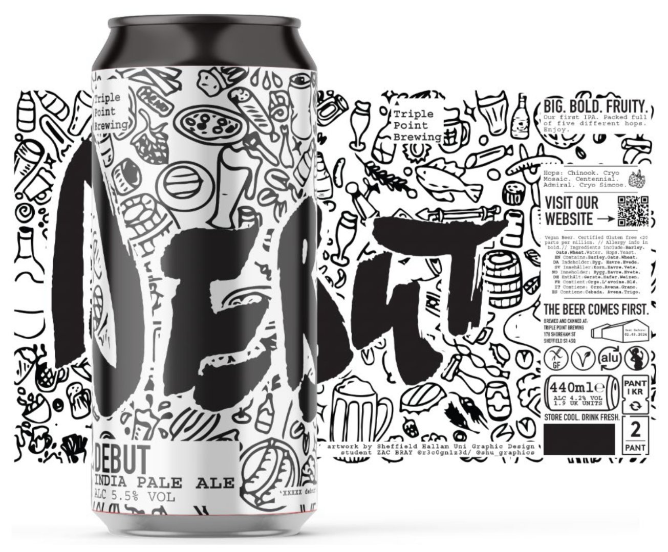
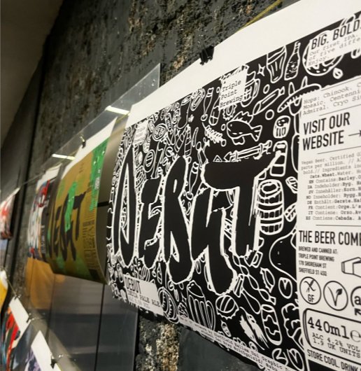
Can label and beer mat artwork for Triple Point Brewing's debut IPA — a 5.5% Sheffield-brewed pale, big on hops, short on compromise.
The brief demanded something that felt raw and handmade without losing structure. The result: a brushstroke logotype crashing through a dense doodle world of food, drink and culture — chaotic on first look, intentional on the second.
Every element earns its place. The chaos is controlled, the craft is real. A label designed to be picked up, looked at twice, and remembered.
A Sheffield brewery launching their first IPA needed an identity as bold as the beer itself — something that felt local, independent, and unapologetically hand-crafted.
Brand Identity · Packaging · Rebranding · Digital · Campaign
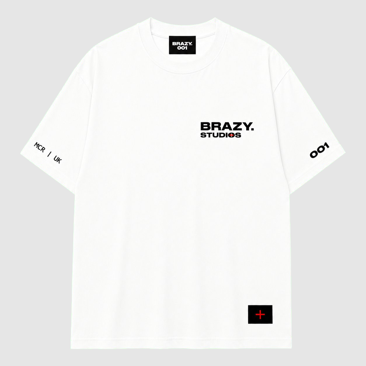
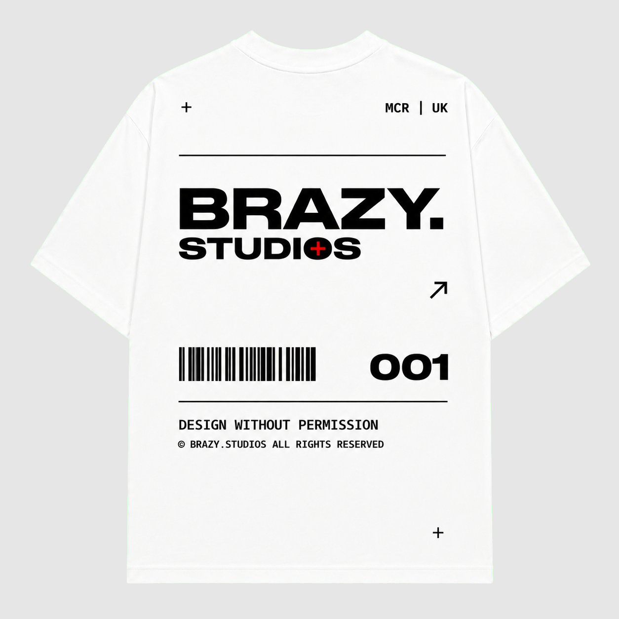
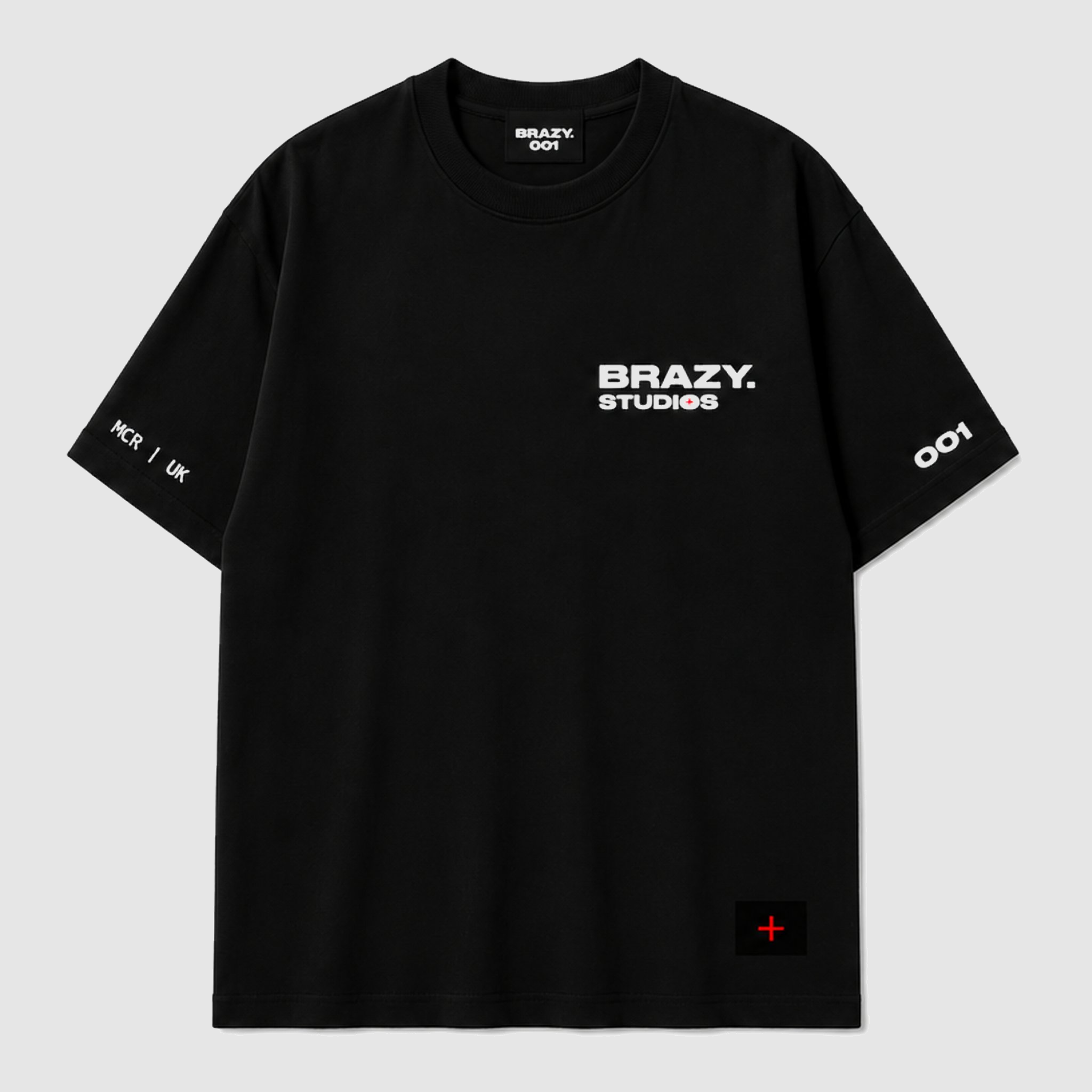
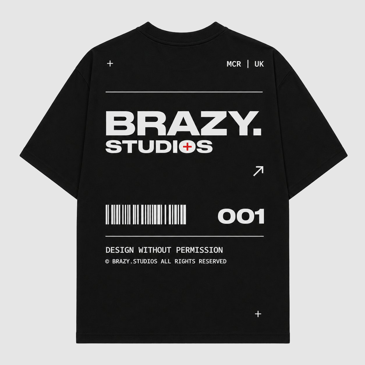
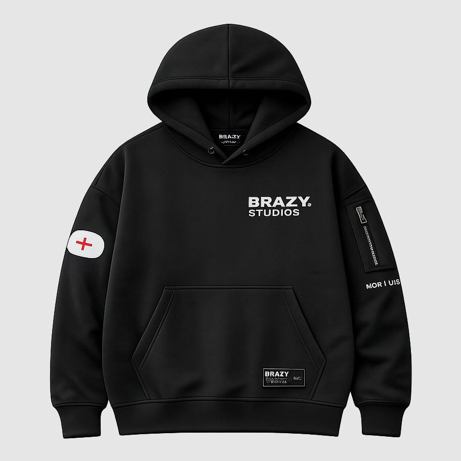
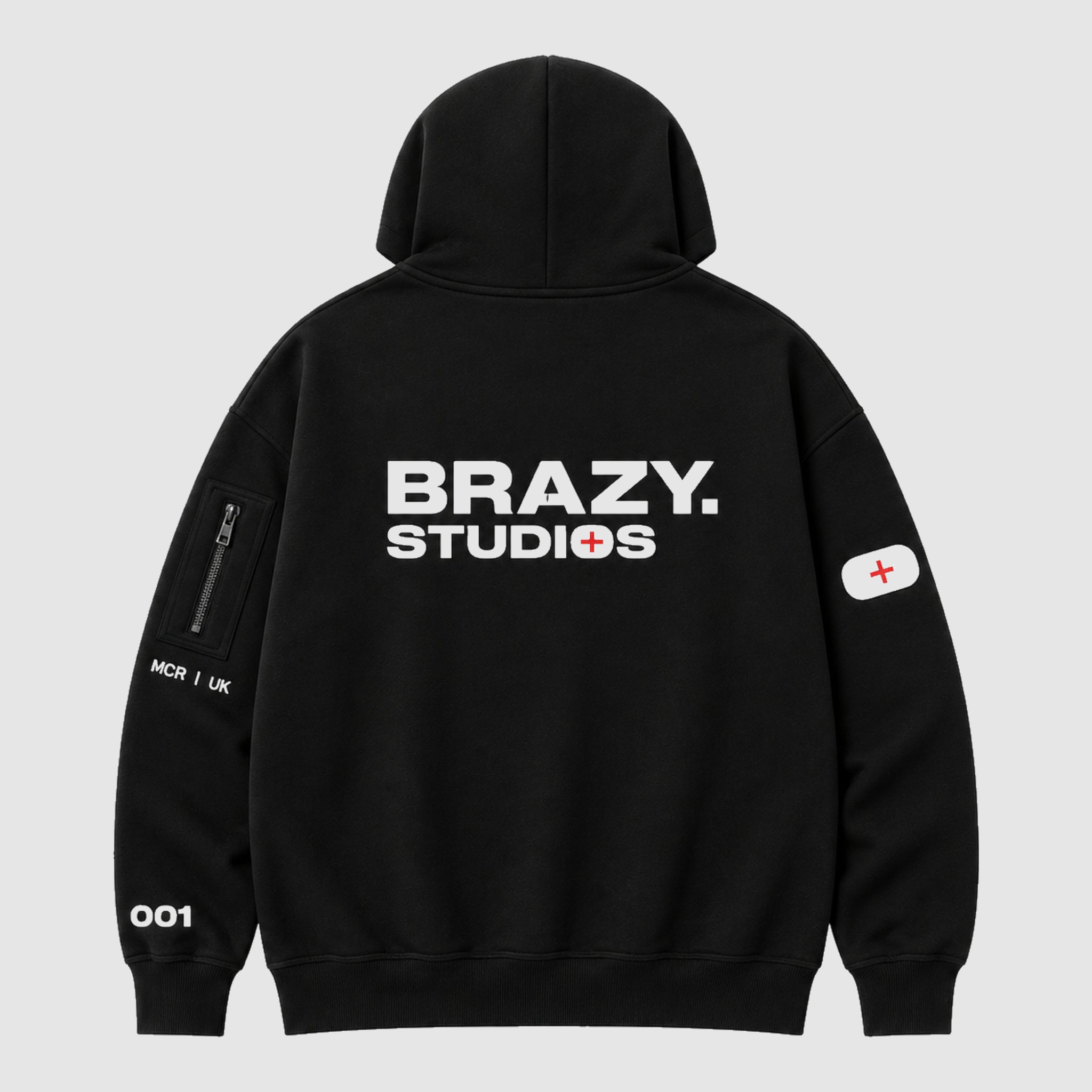
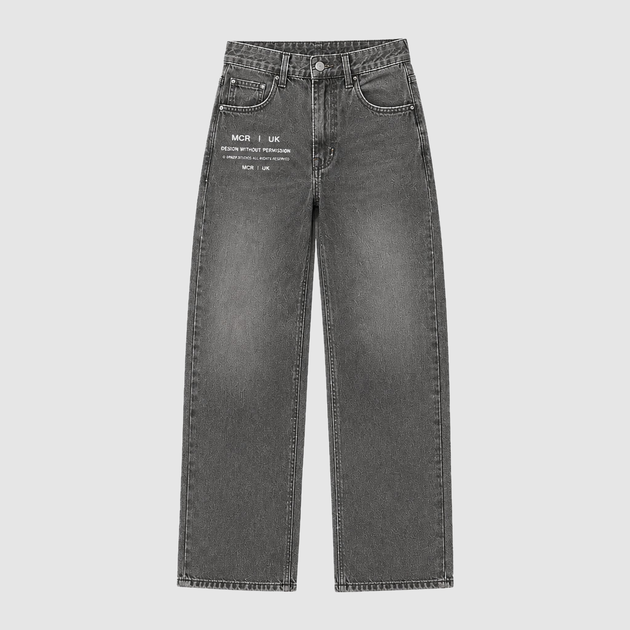
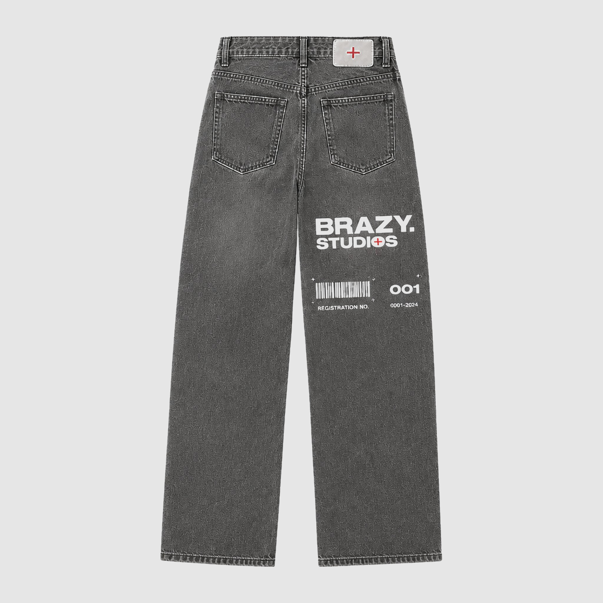
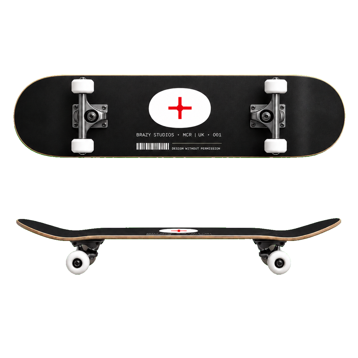
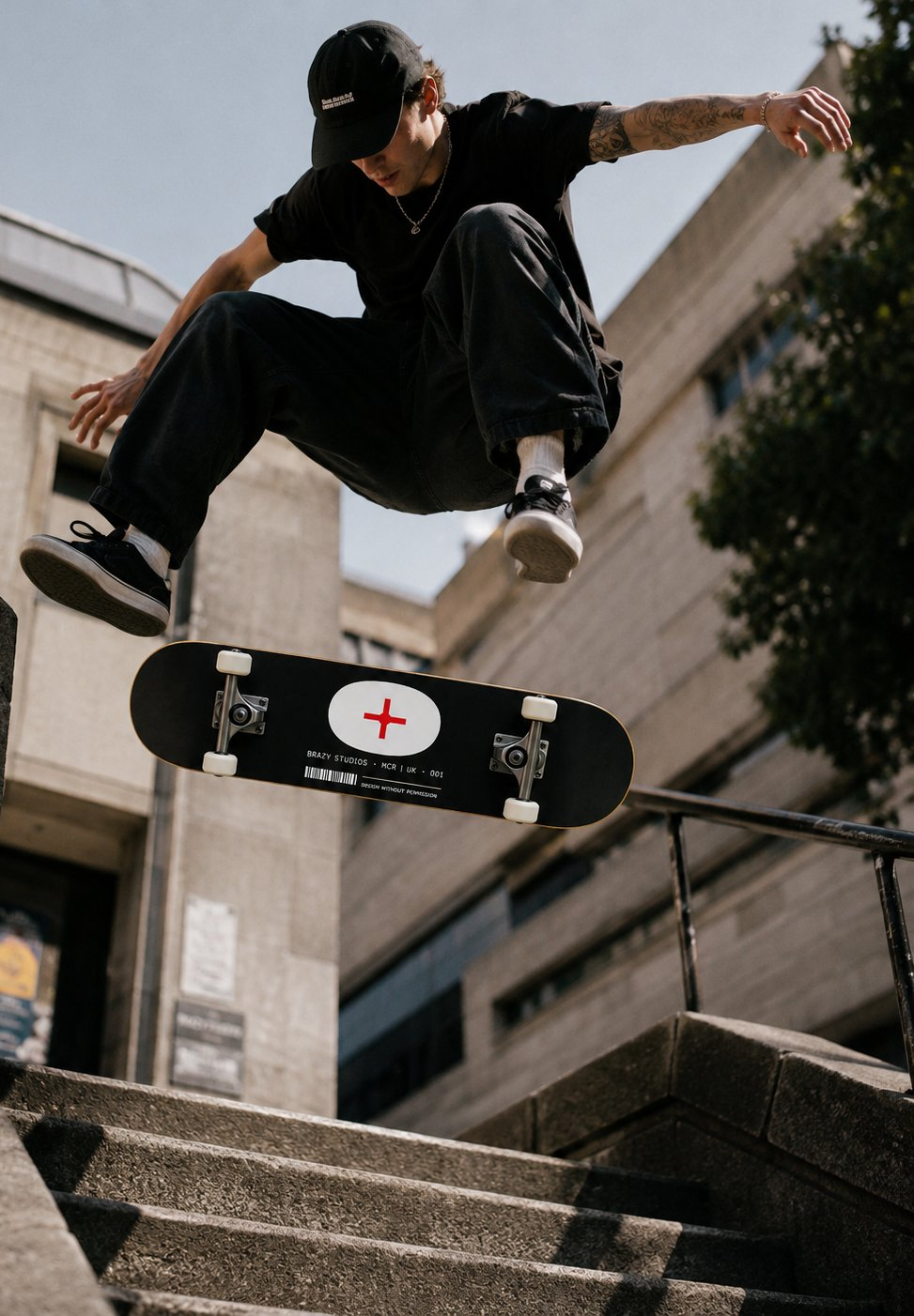
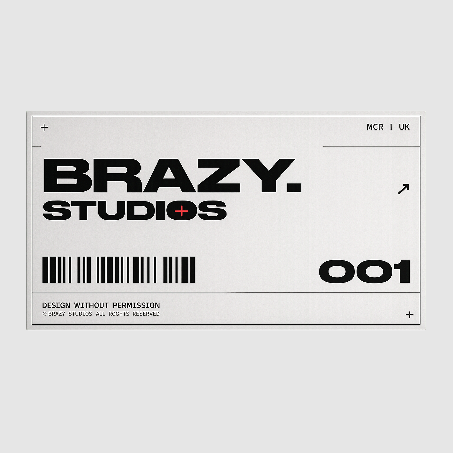
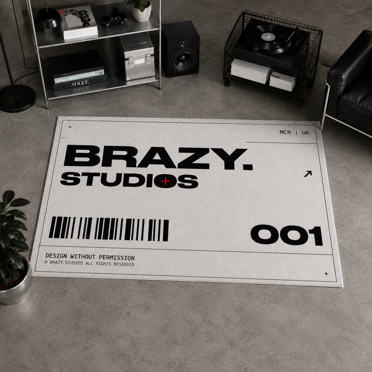
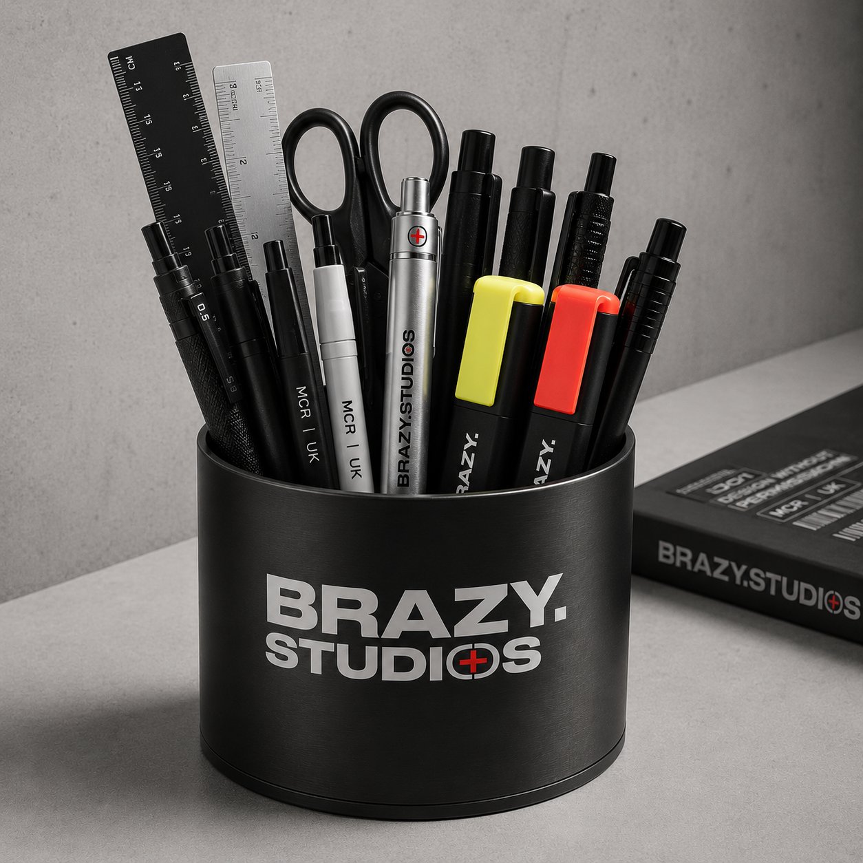
Zac Bray is a Manchester-based graphic designer and creative director operating under Brazy.Studios — a one-person studio built at the intersection of street culture and architectural precision. Every project is self-initiated in spirit, even when it isn't. No committee. No compromise. Design Without Permission.
Brand identity, editorial design, illustration, visual systems. If the project has weight to it, let's talk.