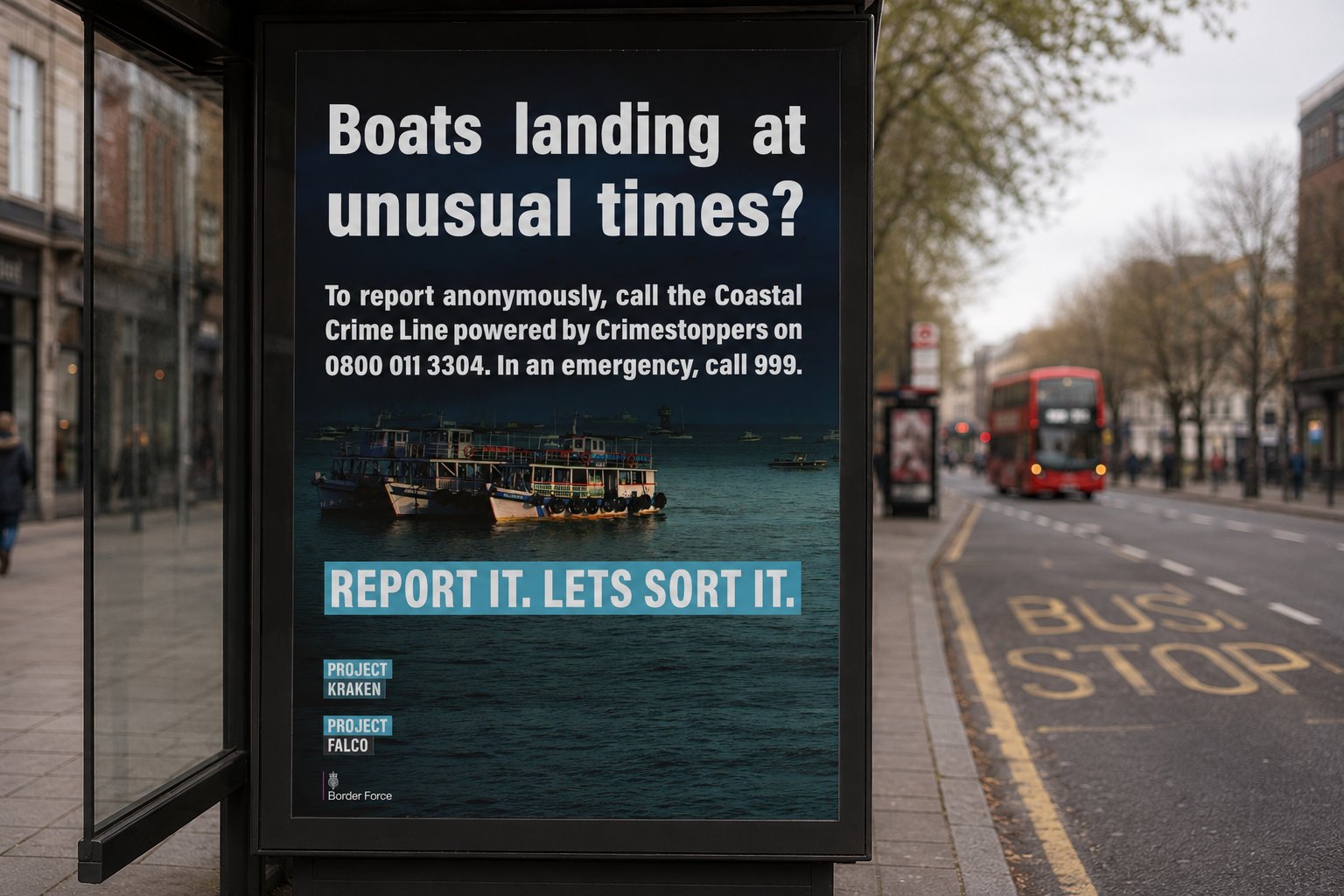
Public awareness campaign for Border Force under Project Kraken and Project Falco — the national initiative to combat organised crime at the UK coastline.
A headline that asks a direct question, imagery that answers it, a call to action with no room for ambiguity. Built for bus shelter scale on busy London streets. Placed. Live. Real.
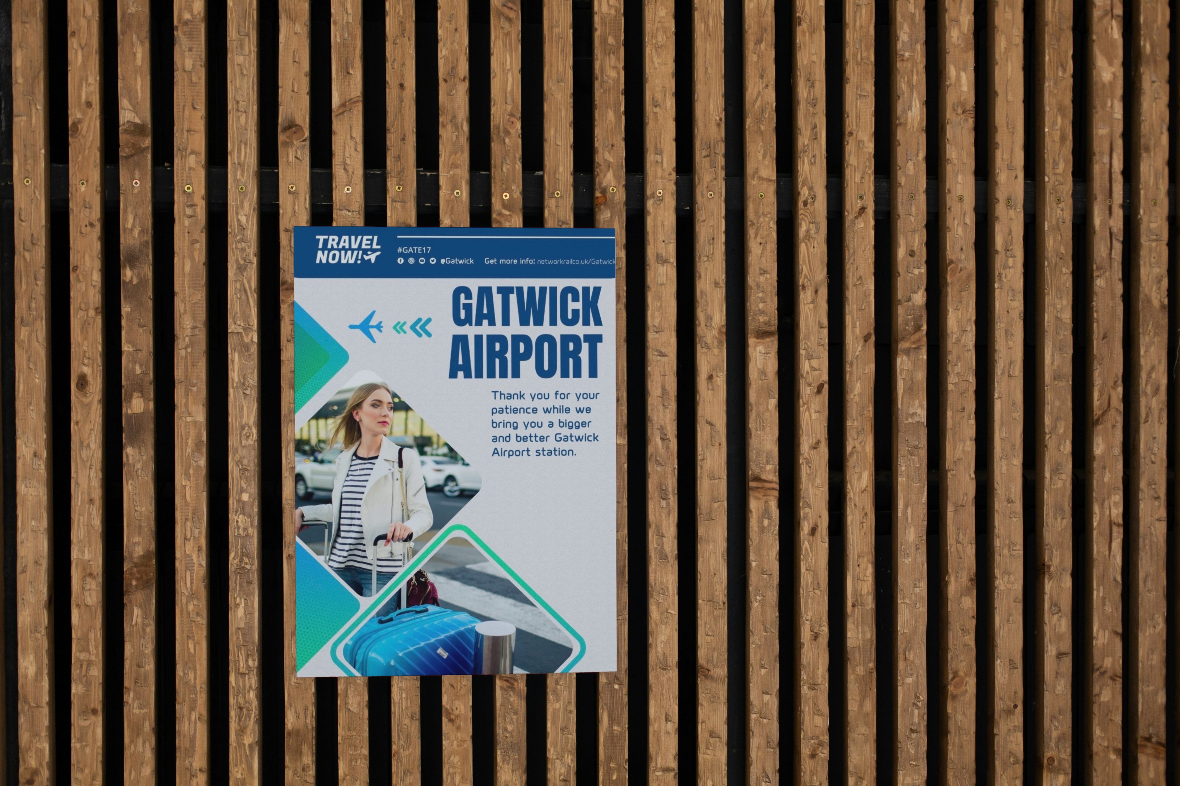
Passenger communication poster for Network Rail's Gatwick Airport station redevelopment — designed to inform without frustrating, and reassure without being invisible.
Produced under the Travel Now! campaign framework, the poster had to work in a high-footfall, high-stress environment where people are already distracted and already late.
Clear hierarchy, considered colour, and a layout that delivers the message before anyone has time to stop walking. The design system uses Network Rail brand guidelines as a foundation while pushing the execution toward something more human. Real-world placement confirmed. Job done.
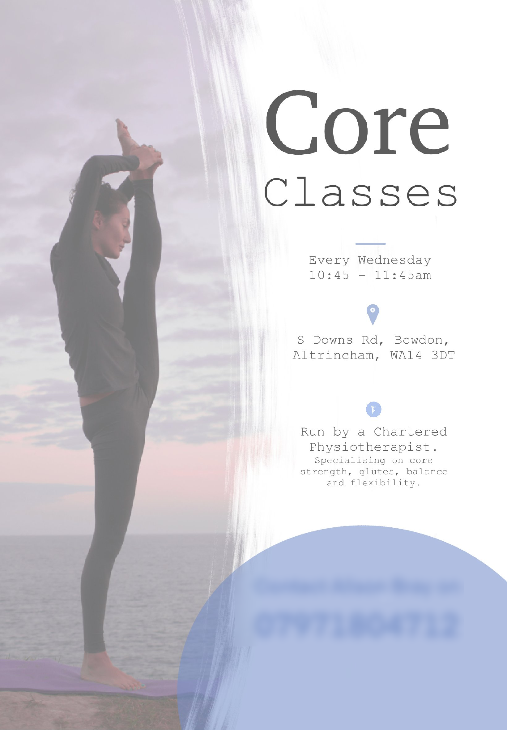
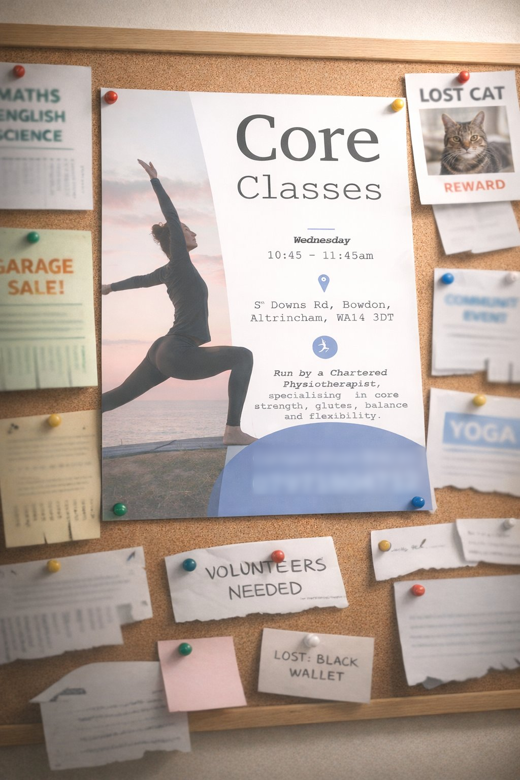
A poster built to stop people mid-scroll — or mid-corridor. Designed for a Chartered Physiotherapist running weekly core sessions in Bowdon, Altrincham.
Credible, calm, worth pinning up. Clean typography, considered layout, real-world placement. Design that works without shouting.
No clutter, no compromise. Just the information that matters, in the order it needs to land. The kind of work that looks effortless because the effort went in the right places.
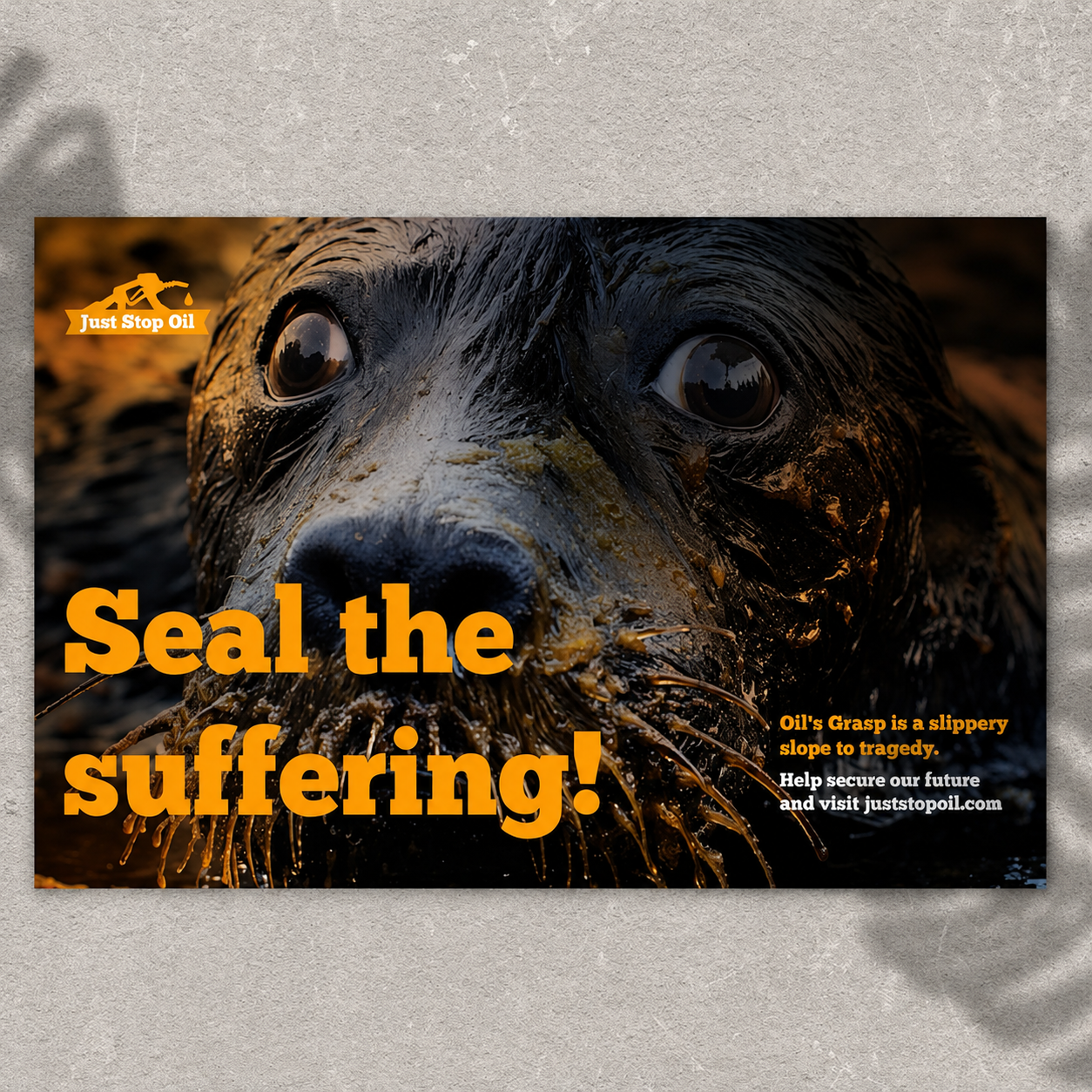
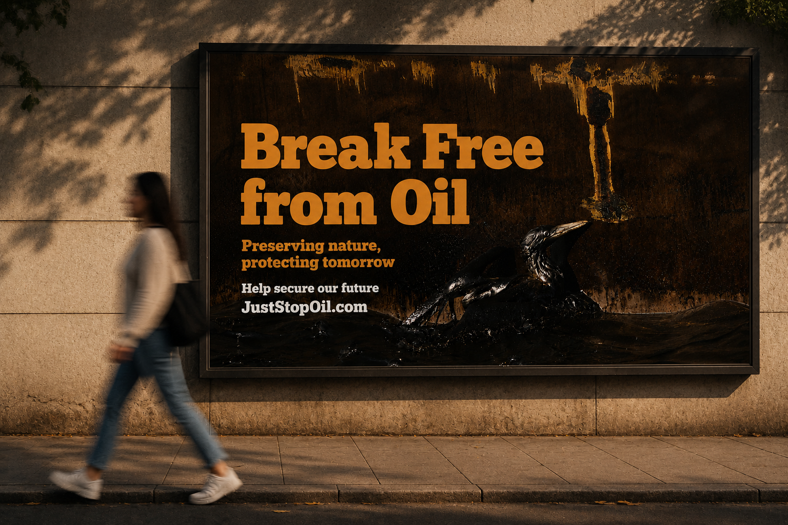
A self-initiated rebrand concept for Just Stop Oil — one of the most divisive organisations in the country, and one whose visual identity wasn't doing the argument any favours.
The brief: keep the urgency, raise the message. Two campaign executions built in a language that's confrontational by design — a close-up of an oil-drenched seal that stops the scroll, and a full-bleed billboard that stops the street.
Orange on black. Type at scale. Photography that leaves no room between the subject and the viewer. The movement has the message. This gives it the visual system to match.
The rebrand doesn't soften the cause — it sharpens it. Strip the chaos, keep the conviction. Design as an act of solidarity.
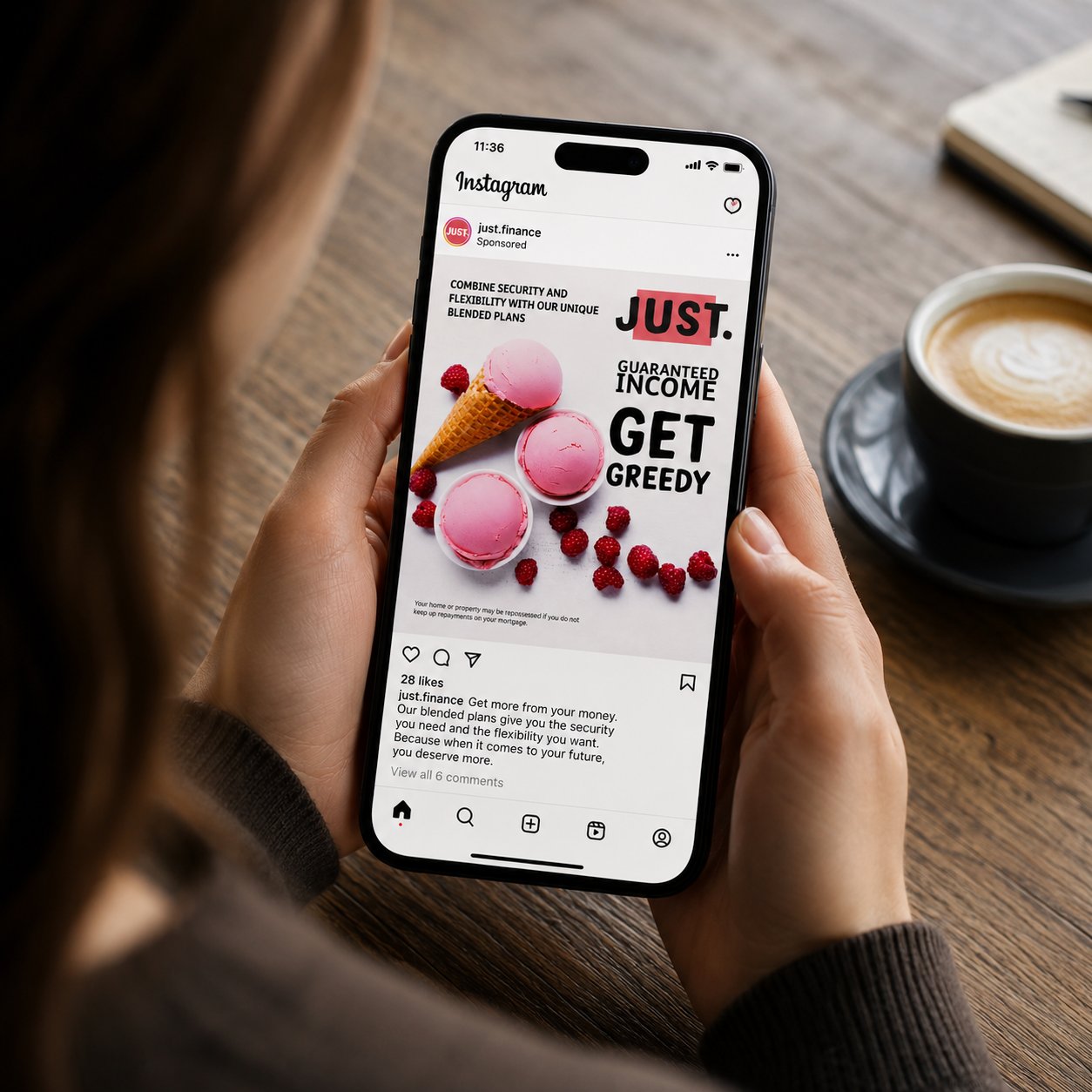
Sponsored Instagram ad for JUST. — a financial services brand selling guaranteed income plans. The challenge: make a pension product feel desirable to someone mid-scroll.
The solution: lead with appetite, not anxiety. Ice cream and raspberries doing the heavy lifting that a graph never could. “Get Greedy” reframes retirement planning as something worth wanting rather than something worth dreading.
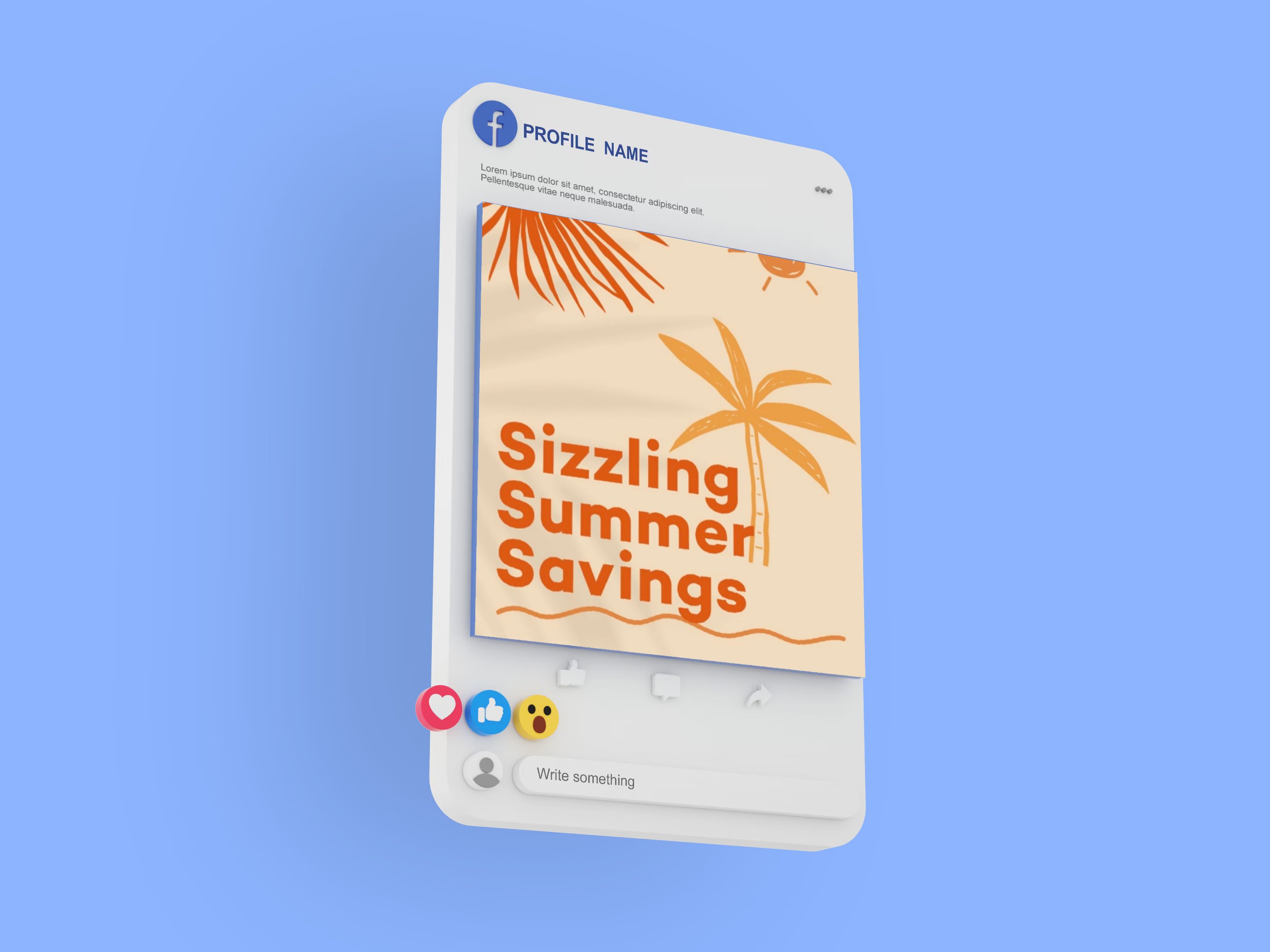
Two formats produced: square social post and Facebook sponsored unit. Both designed to earn attention in a feed built to resist it. Tone-first design for a sector that usually plays it safe. This one didn't.
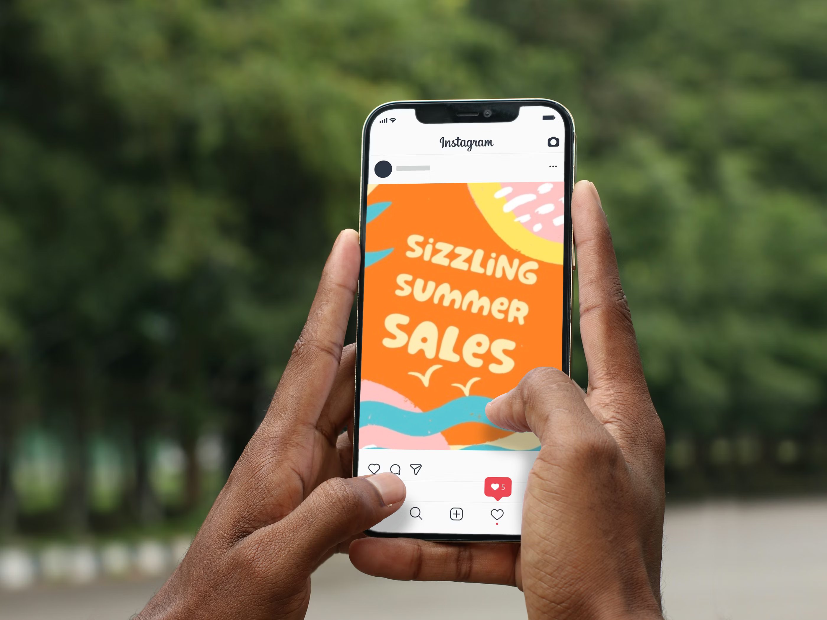
Social media campaign graphics for a local seamstress based in Altrincham — a summer sales push designed to cut through the noise of a crowded feed without losing the handmade, personal feel the business is built on. Two formats: Instagram and Facebook. The brief was warmth over polish — illustrated shapes, hand-rendered type, a palette that feels like the season rather than just naming it. Small business energy, properly designed. Proof that considered graphic design isn't just for the big clients.
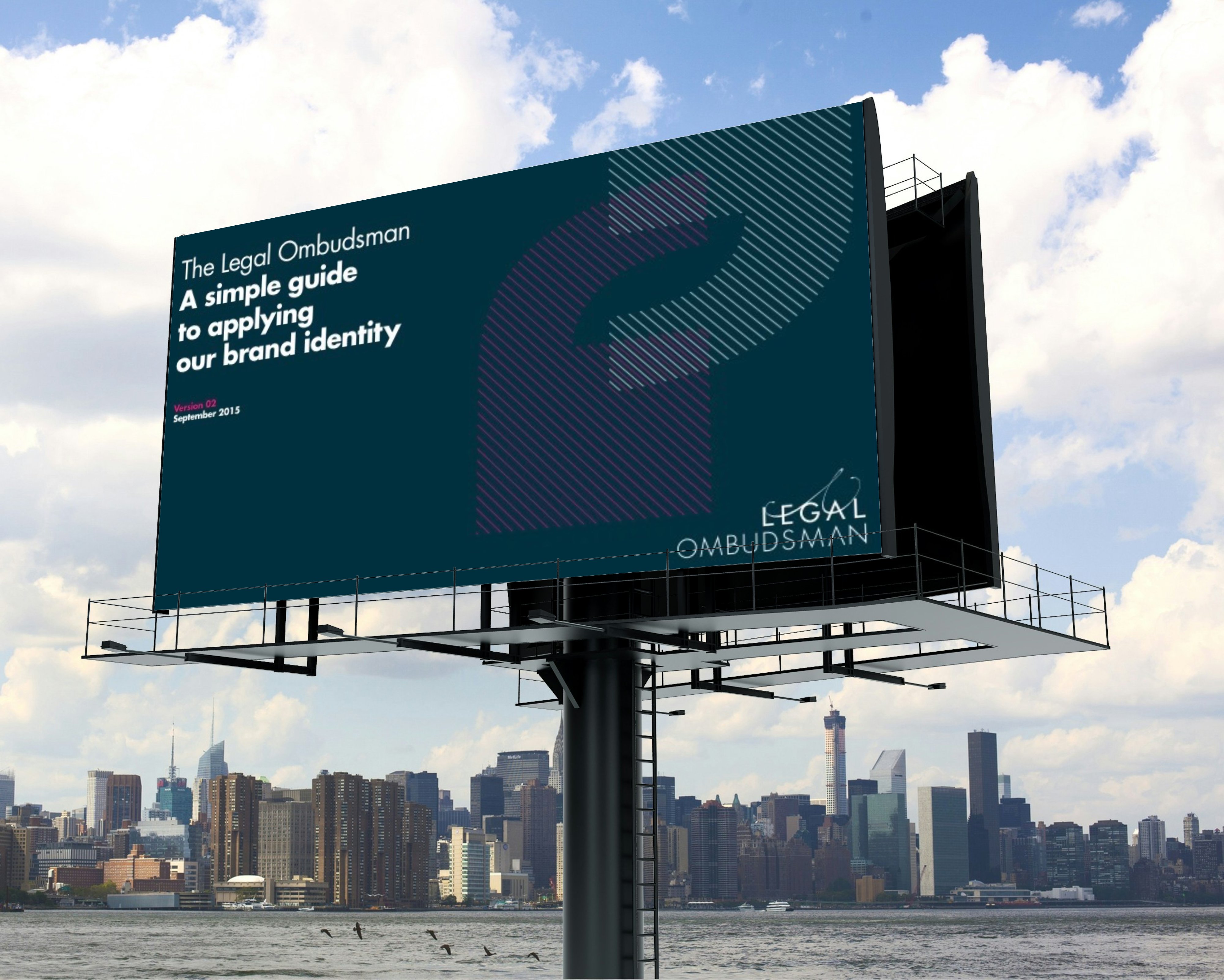
Brand identity guidelines document for the Legal Ombudsman — the body that holds the legal profession to account.
The brief demanded something that felt authoritative without being impenetrable, and considered without being cold. The result is a system built on clarity: teal and magenta pulling against each other, geometric patterning that gives structure to the page, typography precise enough to mean what it says.
The guidelines cover logo usage, colour application, typography hierarchy, and real-world placement. Shown at billboard scale to prove the system travels beyond the document. Institutional design done with conviction.
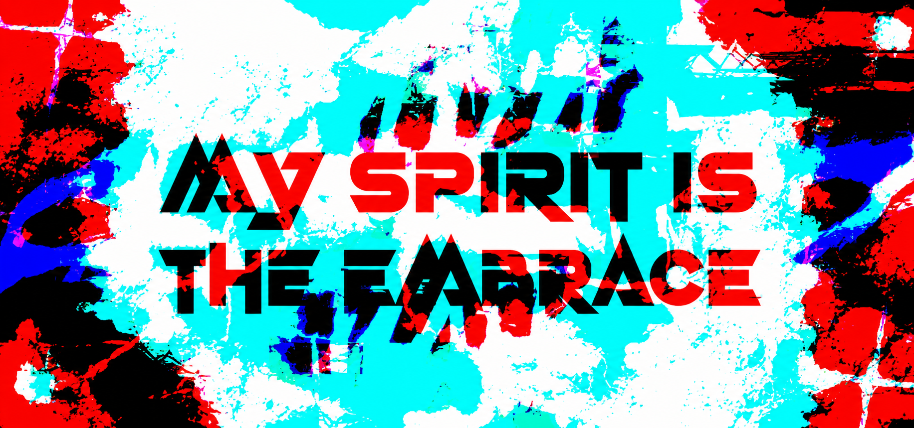
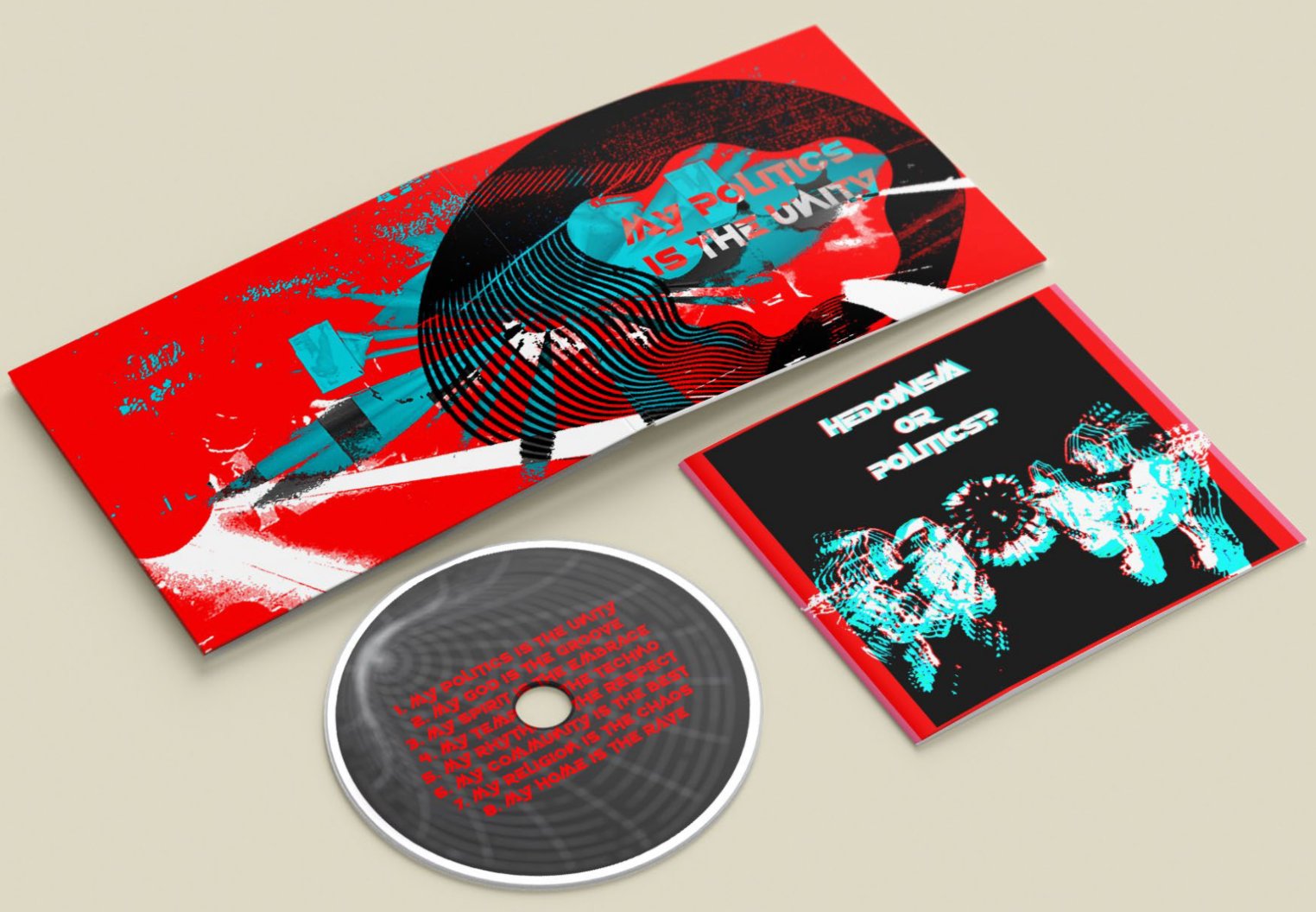
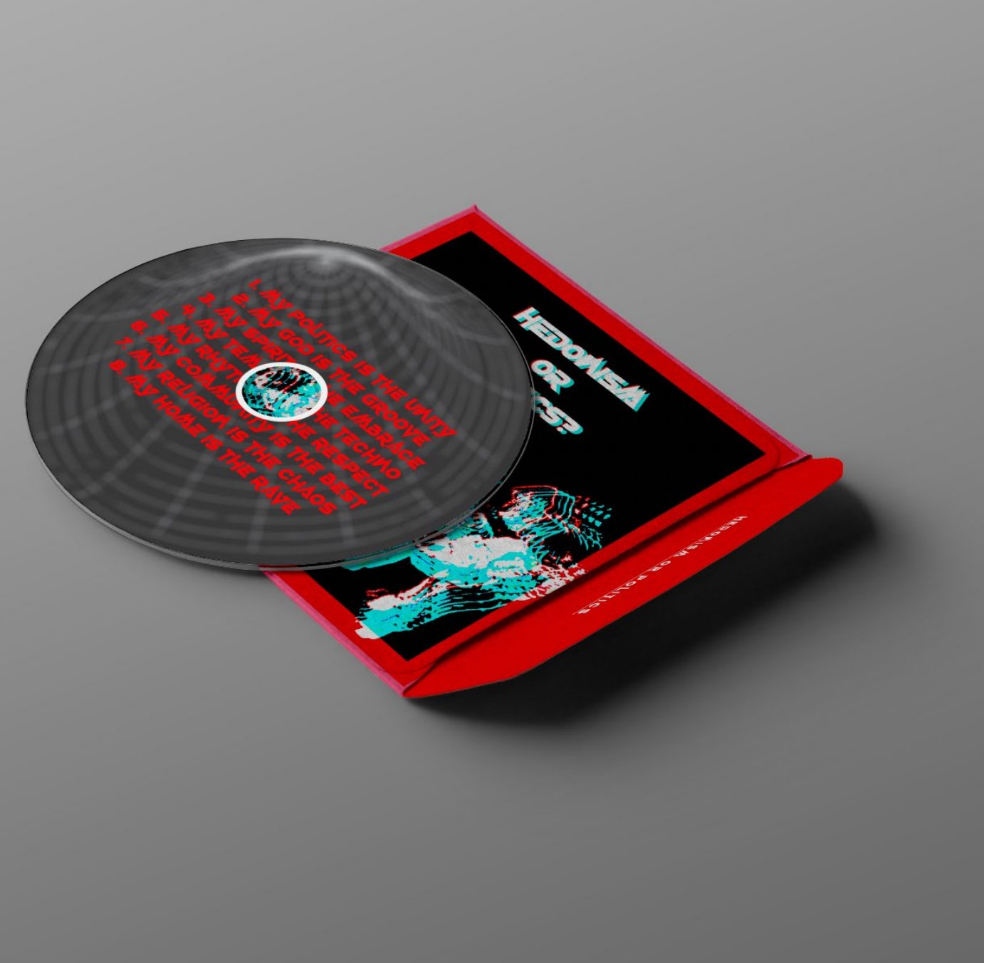
CD packaging for a concept built around rave culture as resistance. Eight tracks, eight manifestos — my politics is the unity, my god is the groove, my home is the rave.
The artwork doesn't ask permission: overdriven colour, fractured type, vinyl grain and noise weaponised into a visual language that feels as urgent as the music it houses.
Red, black, and cyan cutting through each other like a sound system at 4am. The digipak unfolds to reveal a full-bleed inner sleeve, printed disc, and outer case — every surface designed as part of a unified system. Disorder with a point.
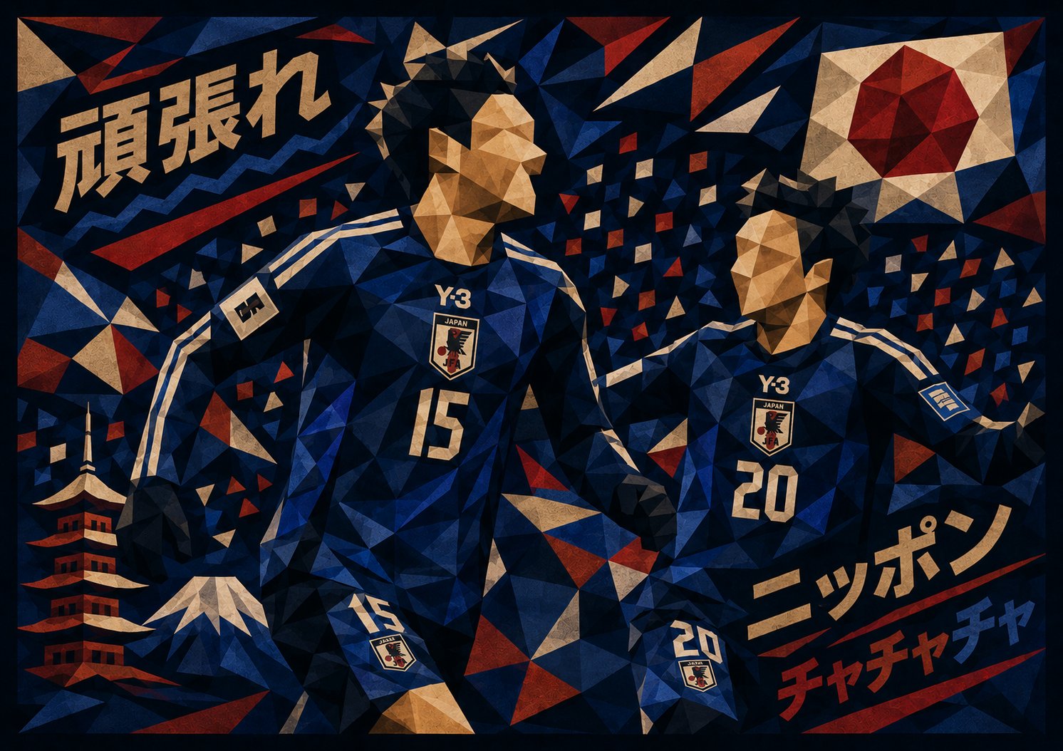
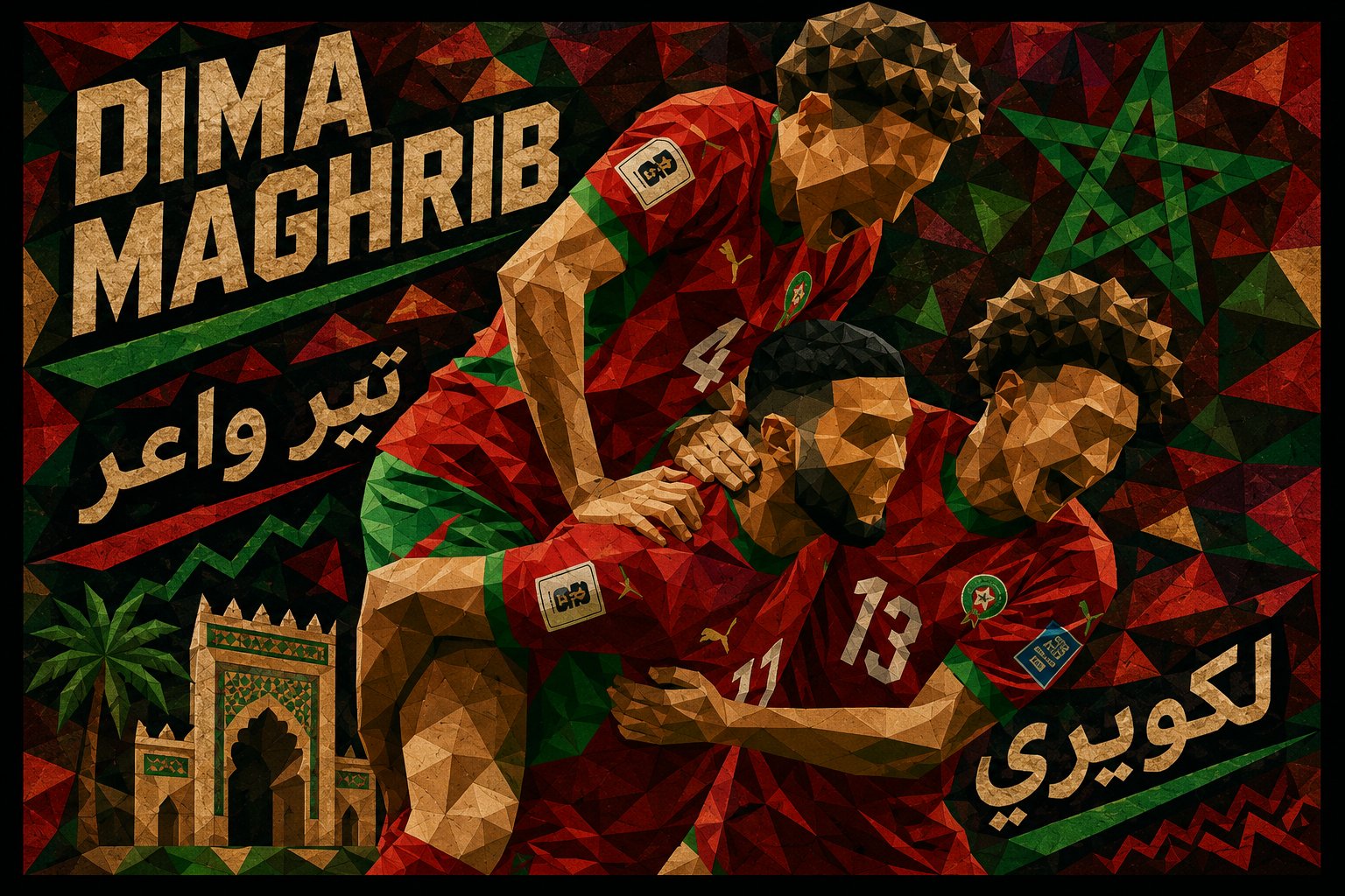
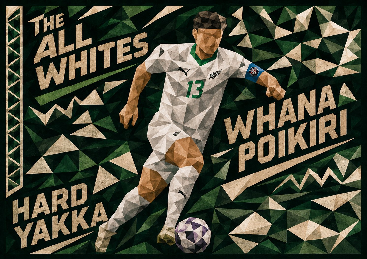
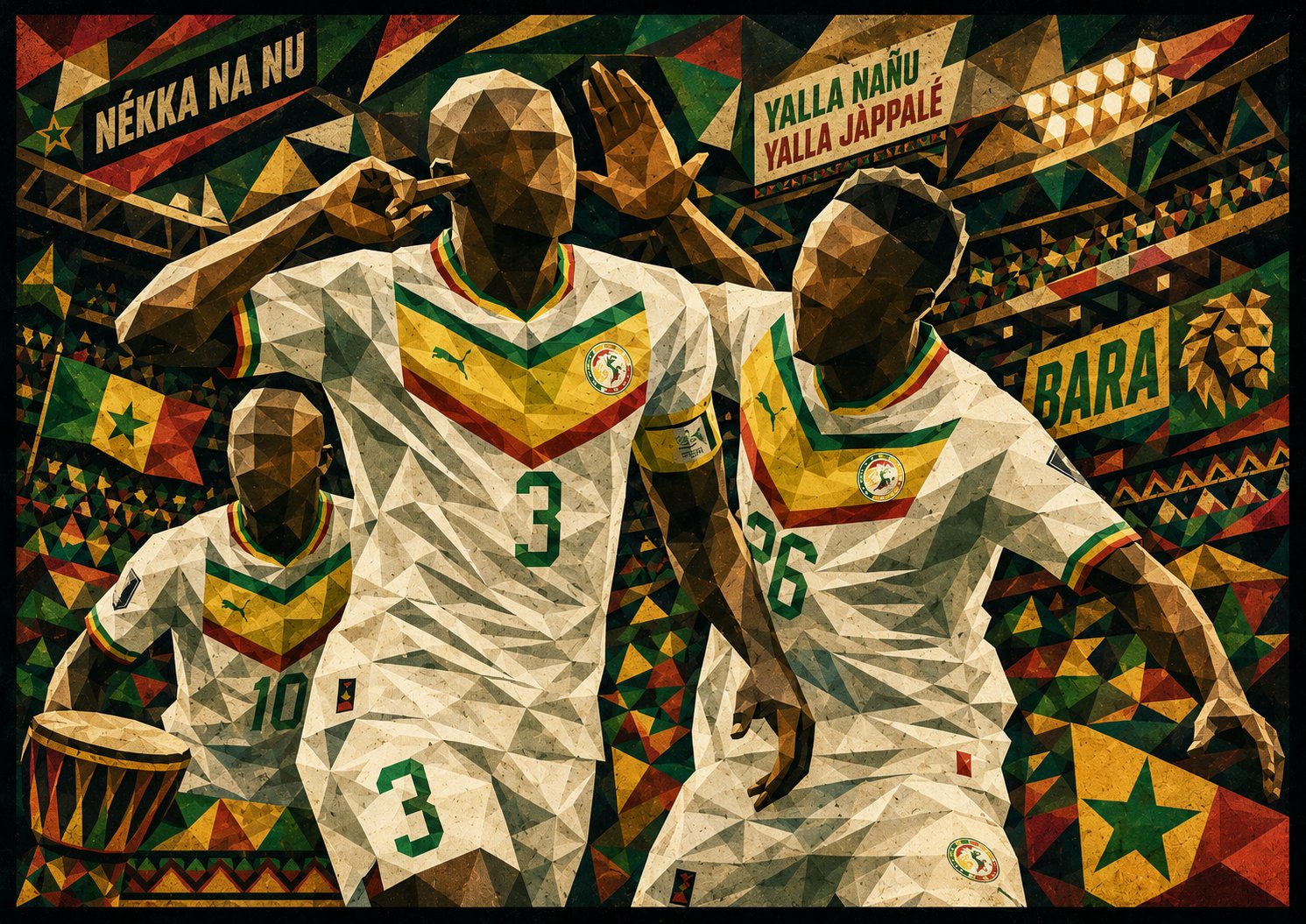
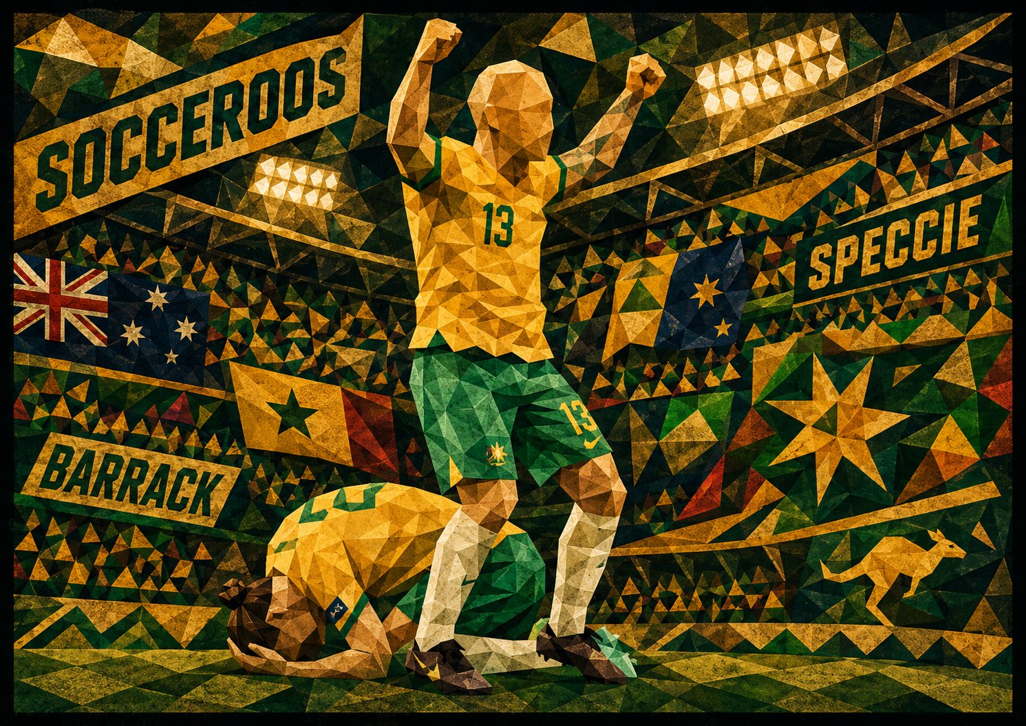
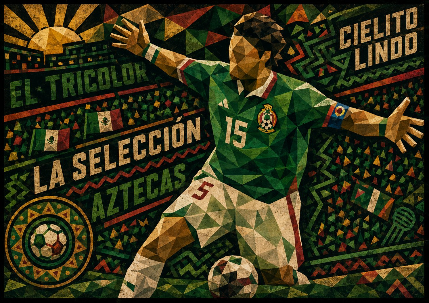
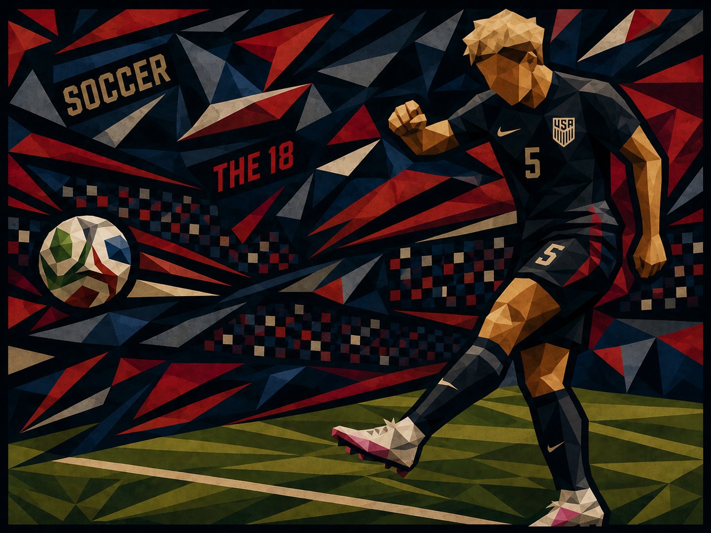
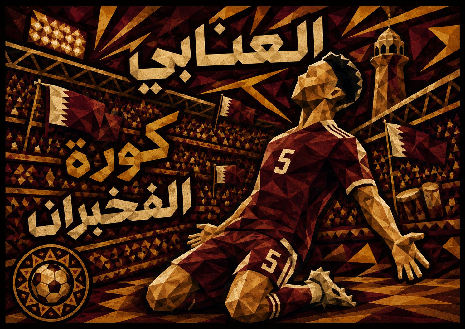
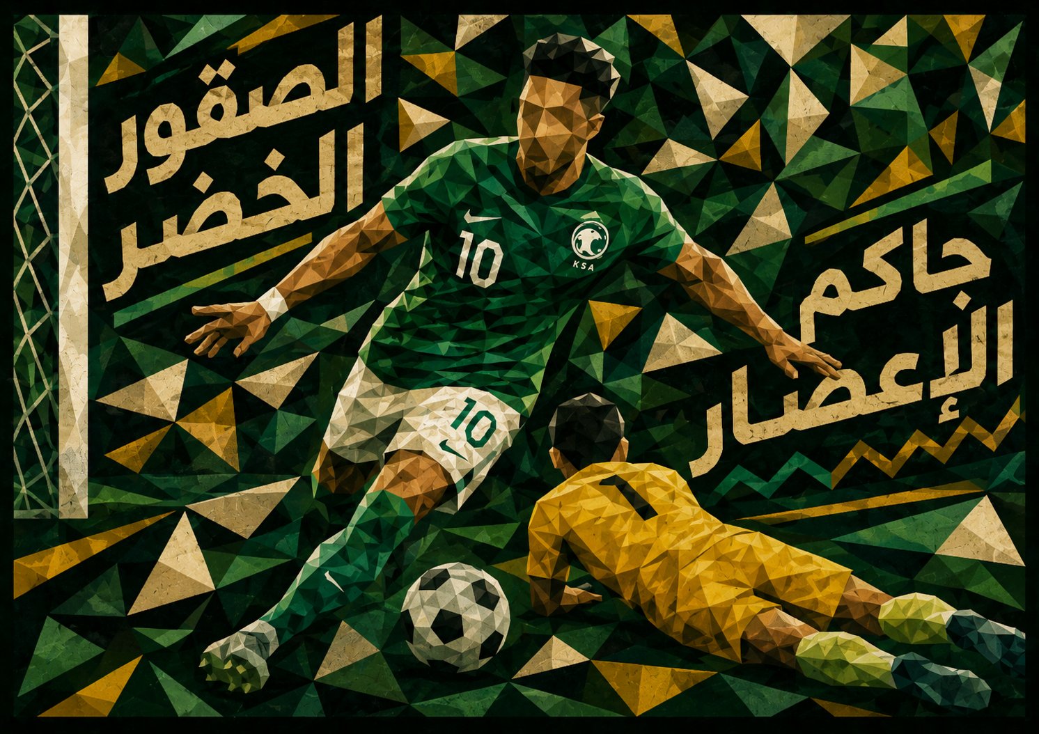
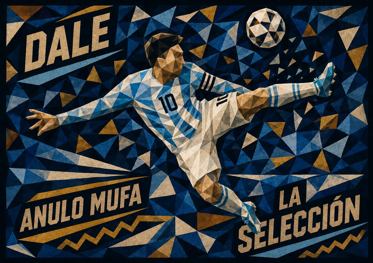
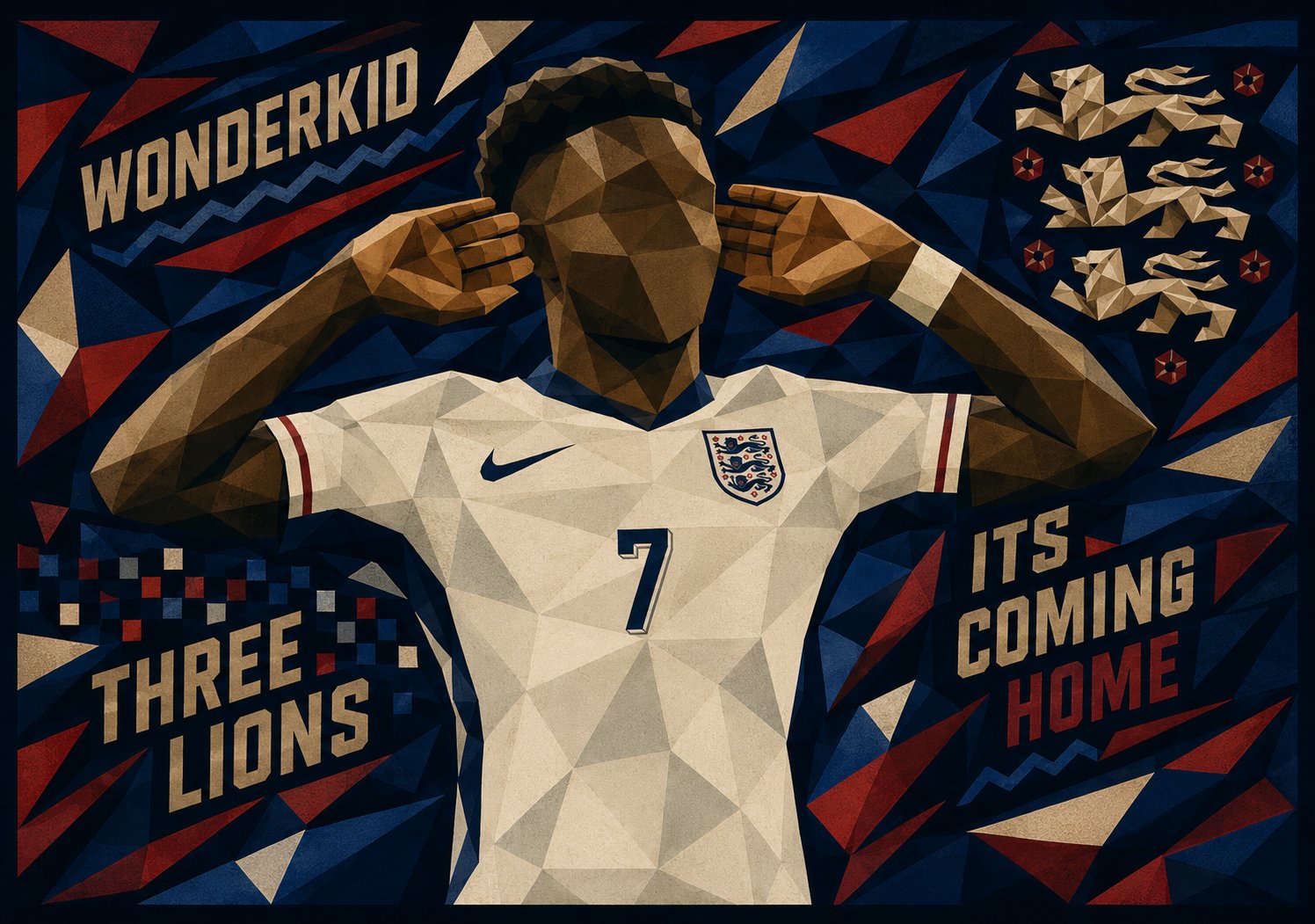
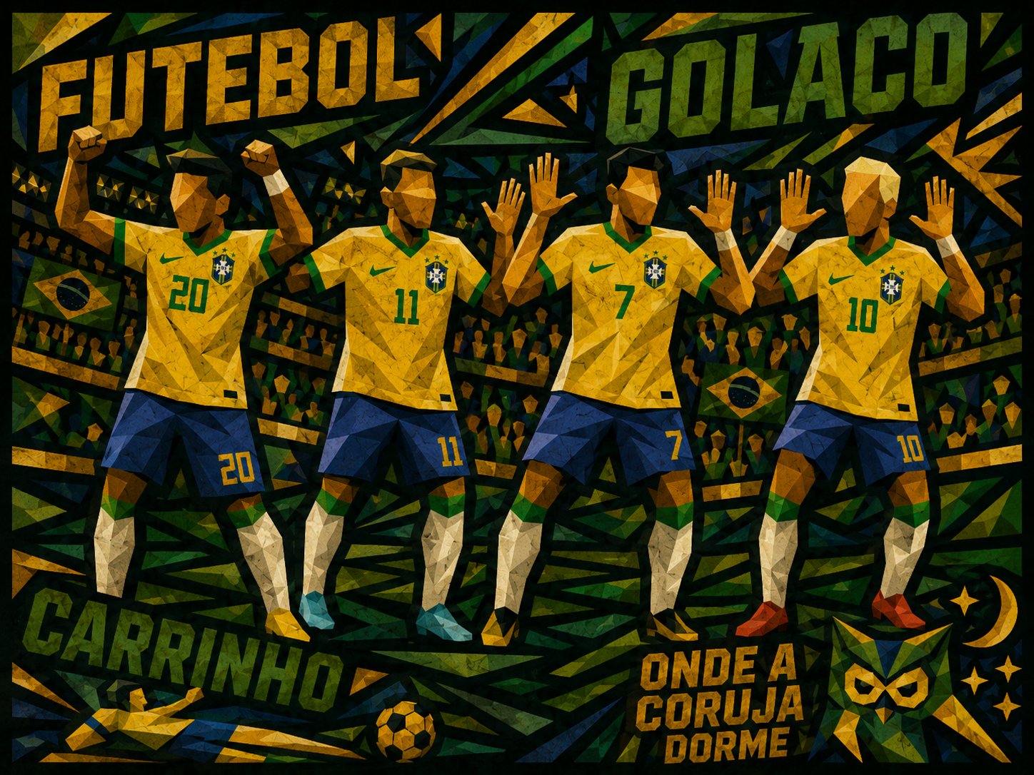
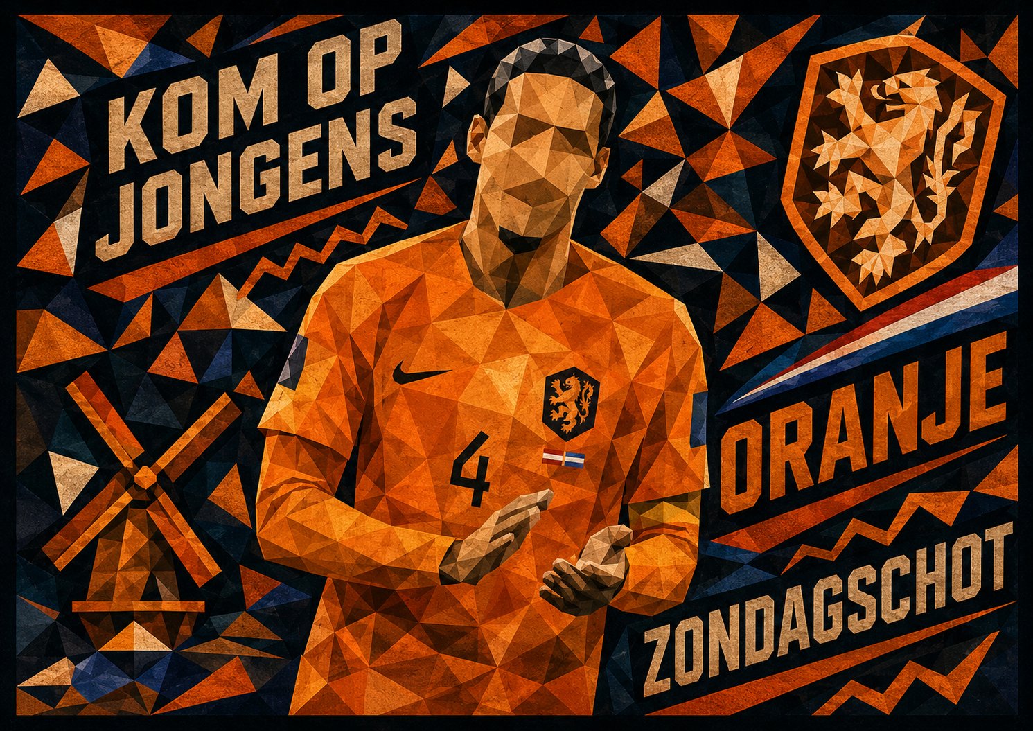
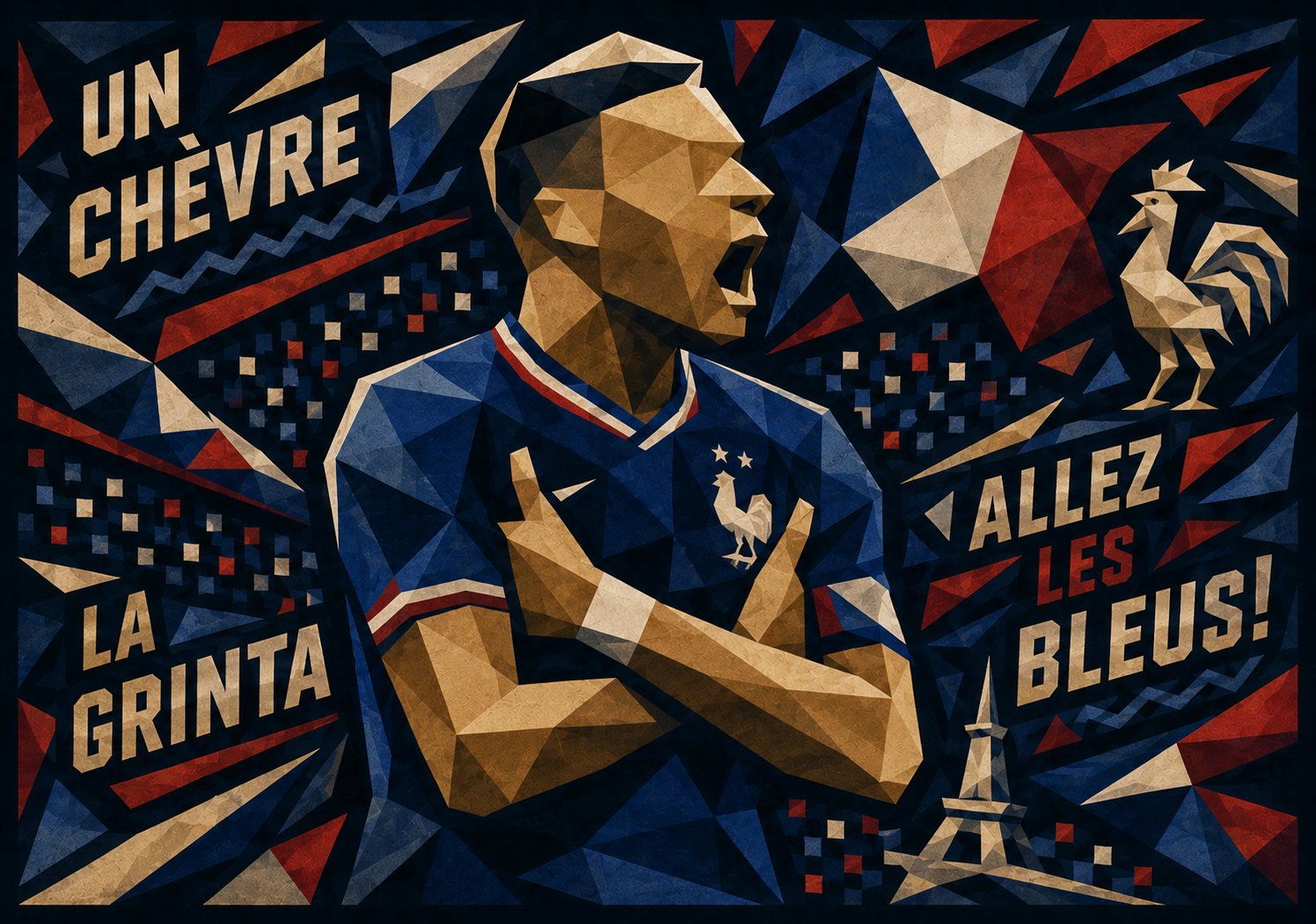
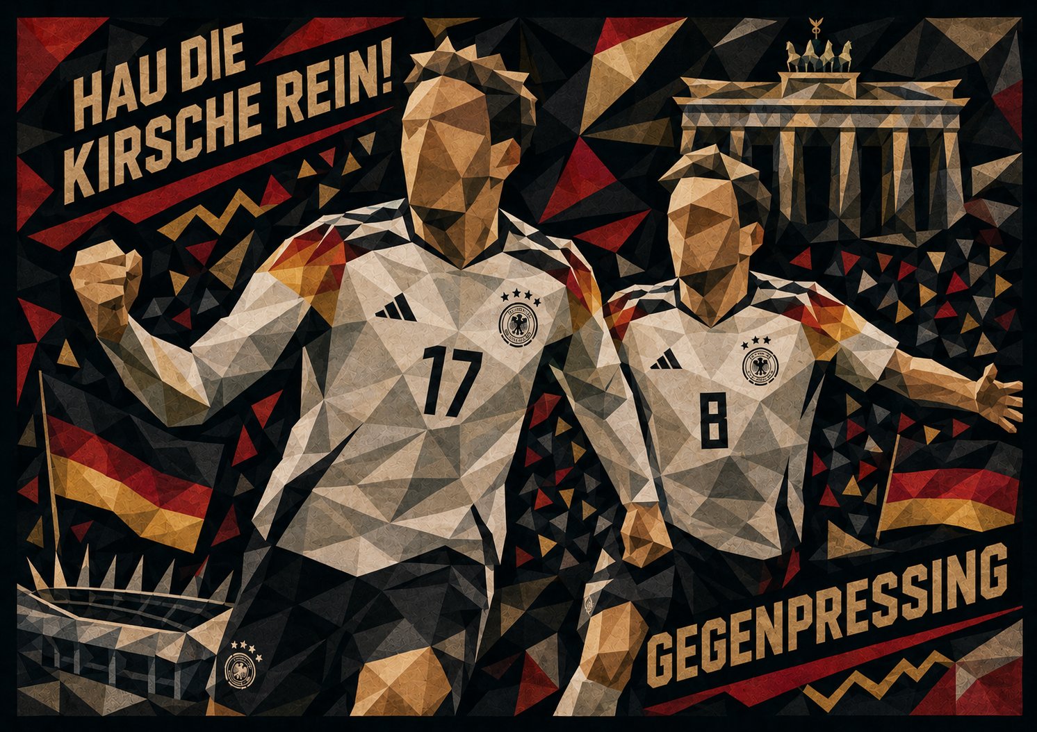
15 nations. 15 geometric illustrations. Each poster translates a country's football culture into structured low-poly illustration — built from national colours, iconic landmarks, and the chants that define each fanbase.
Raw cultural energy, precision-built. A self-initiated editorial series exploring how identity travels through colour, form and noise — no brief, no client, just the idea that every fanbase deserves a poster as loud as they are.
Brand identity, editorial design, illustration, visual systems. If the project has weight to it, let's talk.